
INDUCED travel due to changes in the transport network is a well-known phenomenon. For many years, it was ignored in transport modelling, by accounting only for re-routeing of trips rather than mode shifts or origin and/or destination changes.
Nowadays, most modelling includes it, thus producing variable trip matrices between scenarios rather than fixed ones.
A key point is that induced travel makes a project (especially a road project, where travel times are very sensitive to the amount of traffic) a ‘victim of its own success’. A road improvement attracts more traffic than is explained by re-routeing alone. This extra traffic reduces the travel time savings that a project might provide, which in turn reduces its economic benefit.
I’d argue that the only reason induced travel is regarded as a distinct phenomenon is because of the history of transport modelling. Modelling techniques started with simple assignment of a fixed number of trips to a network representing a single mode (mainly road). Thus, it only captured route changes. Multimodal capability was added later, bringing mode shift effects to the mix. Also, by looping back through trip generation and distribution, the effect of a network change on the number and distribution of trips was also estimated.
Most four-step transport models have stopped there; only a few of them attempt to calculate changes to the time of day of trips (to predict peak spreading), and none are capable of modelling land use changes due to a project; this is usually done outside the transport model.
There are a number of land use-transport interaction (LUTI) models around, but they’re very difficult and costly to set up and calibrate. Historically, their usefulness was limited because of this, but now it seems they’re gaining renewed interest.
The pace of change
There seems to be a view, expressed in recent business cases, that it takes a long time for induced traffic effects to materialise because people are thought to be slow to change their origin, destination, travel mode and route choices after a new project opens.
Conveniently, the longer induced traffic takes to grow, the larger the scheme benefits are in the early years of the benefit stream. This is where it matters most, before the discount rate kicks in too much.
Evidence produced to support this view is based on flawed, old studies. One that still gets quoted a lot in Melbourne is ‘Long run economic and land use impacts of major infrastructure projects’ (SGS Economics & Planning, 2012). Commissioned by the Victorian Department of Transport, this study looked at post-opening effects of CityLink, Western Ring Road and the City (rail) Loop. It was mainly concerned with induced land use changes, and its basis and results were highly questionable. For example, its estimates of the effects of these projects on population was completely at odds with Census data. CityLink was supposed to have induced population growth of 21,500 in Prahran and 13,000 in Hawthorn from 2001 to 2011, but ABS says they only grew by 6,500 and 4,700 in total, respectively. Western Ring Road supposedly caused a 2,800 population increase in Broadmeadows from 1996 to 2011, whereas ABS data shows it went down by 2,000! There were many more inconsistencies.
A major flaw in many of the arguments put forward is that they confuse induced traffic arising from the immediate network effect of a new project with that from longer-term changes in land use. Therefore, quoting studies like the (flawed) SGS one in relation to non-land use associated induced traffic is completely incorrect anyway.
In the West Gate Tunnel business case for example, induced traffic effects were phased in gradually over a full 10 years. I reckon this increased the user benefit stream by about 7% (compared to a more reasonable, but still conservative, 3 years’ phasing in). They were behavioural shifts only, represented by comparing a fixed-trip model run with a variable one, using the same land use projections in each. Land use changes can conceivably take that long, but they were excluded. Moreover, the transition between the fixed and variable model results was treated as a straight line instead of some sort of inverse exponential relationship with a much larger shift in earlier years then gradually reducing (this is the usual profile for toll road ramp-ups, for example).
Until then, I’d never seen that particular ‘wrinkle’ used to boost benefits. All the other cost-benefit analyses I’ve done, or reviewed, used variable-matrix runs exclusively, thus allowing for induced traffic effects from day one (or, more correctly, year one). They often included a ramp-up allowance in the first year or so, especially (but not only) for toll road projects.
I’ve already written about the Zenith model and its illogical ‘single loop’ method. This produces an arbitrary trip distribution (by using base year demand on a future year network) and then omits to refine it by purposely leaving it out of the model looping and convergence process. The Zenith model also assumes that public transport has unlimited capacity, and that only toll prices (but no other prices in the modelling) will go down in future years due to increased prosperity.
Given these distortions, the resulting estimates of induced travel, like most of the other model outputs, are highly questionable.
So here we have something that materially affects the benefit stream, with very little basis in fact and calculated using very dodgy modelling. This is of course symptomatic of the ‘optimism bias’ (aka deliberate distortion) which infects every major project appraisal that I’ve examined of late.
How often do people relocate?
Prompted by all these thoughts, I’ve been thinking about other ways of getting a handle on how quickly people might change their travel habits. It occurred to me to try and see whether we’re talking about the same people, which seems to be an underlying assumption in the business cases (except when considering land use change).
This led me to look at the pace at which population changes in an area, as opposed to the net growth.
Population growth comes from three things:
- Natural increase (births minus deaths)
- Net internal migration (arrivals minus departures)
- Net overseas migration (arrivals minus departures)
ABS gives all the component numbers for this (publicly-available at SA2 level throughout the country). The data doesn’t show where they move to and from, only where they appear and disappear. At the time of writing it’s available for three consecutive years (ending June 2017, 2018 and 2019).
Using this data, I’ve calculated two measures:
- Annual population growth comprises natural increase plus net internal migration plus net overseas migration (arrivals minus departures), divided by year-start population to give a percentage.
- Annual population change is the number of new people at the end of the year. It comprises births plus internal arrivals plus overseas arrivals, divided by the year-end population to give a percentage. It can be calculated for a single year, but it can’t be easily extrapolated from one year to the next because there’s no way of knowing how many of the new people at the end of a given year are still there at the end of the following year (although one could make some assumptions about that).
Here are some numbers for Greater Melbourne as a whole, averaged over the three years of data:
- Average annual growth was 2.5%. Of this, natural increase contributed 29%, net internal migration 5% and international migration 66%.
- Average annual change was 6.1%. Of this, births contributed 20%, internal arrivals 30% and international arrivals 50%.
Looking at the average figures for all the SA2s in Greater Melbourne (of which there are 302), things get more interesting. Average annual growth is the same, but annual change increases to 14%, due to the large numbers of people relocating within Greater Melbourne every year. Of this, births contributed 9%, internal arrivals 70% and international arrivals 22%.
Internal movement turns out to be by far the biggest component of population change in smaller areas (except in places where lots of new housing is being built). It keeps the real estate market afloat and, in Victoria, provides the bulk of State Government stamp duty revenue on property transactions (especially as new dwellings are exempt).
Looking at how these averages are distributed around the city gets even more interesting!
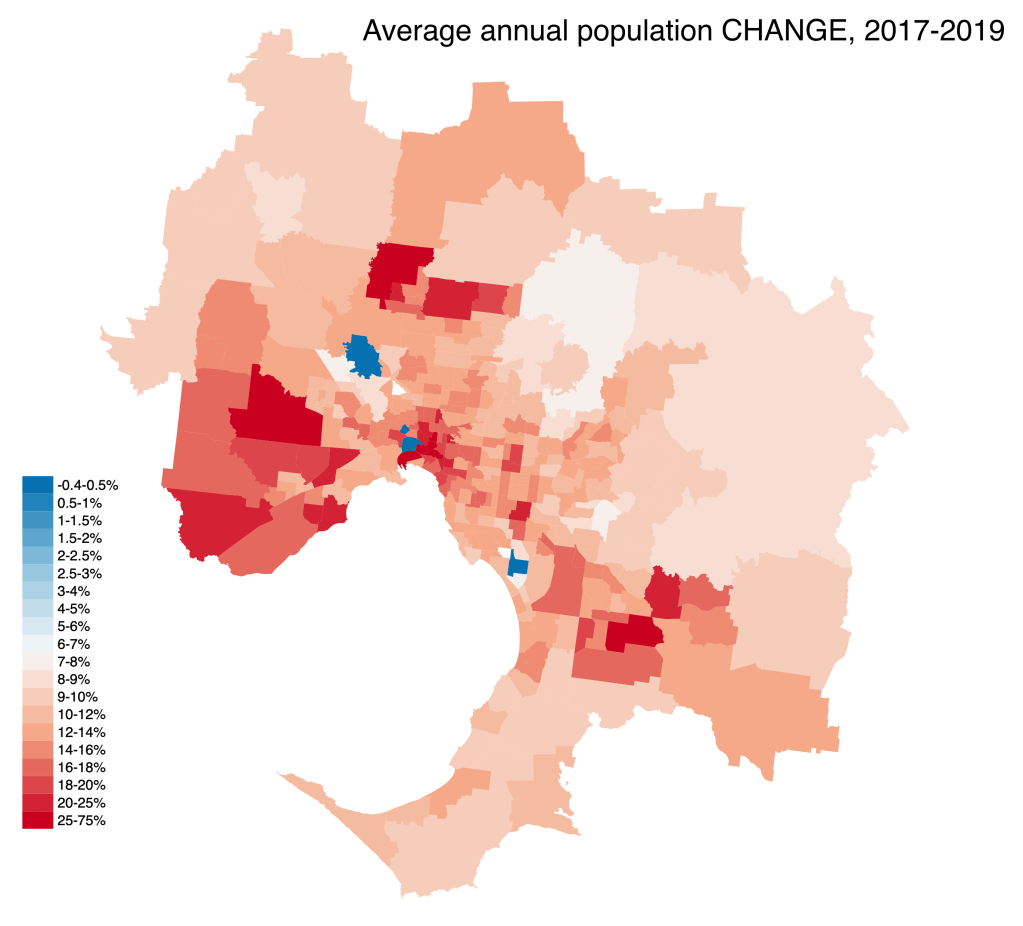
The two maps below show the annual average percentage population growth and change respectively, for the two years 2017-2019, by ABS SA2 area in Greater Melbourne. I’ve rendered them both to the same blue-to-red heat map scale.
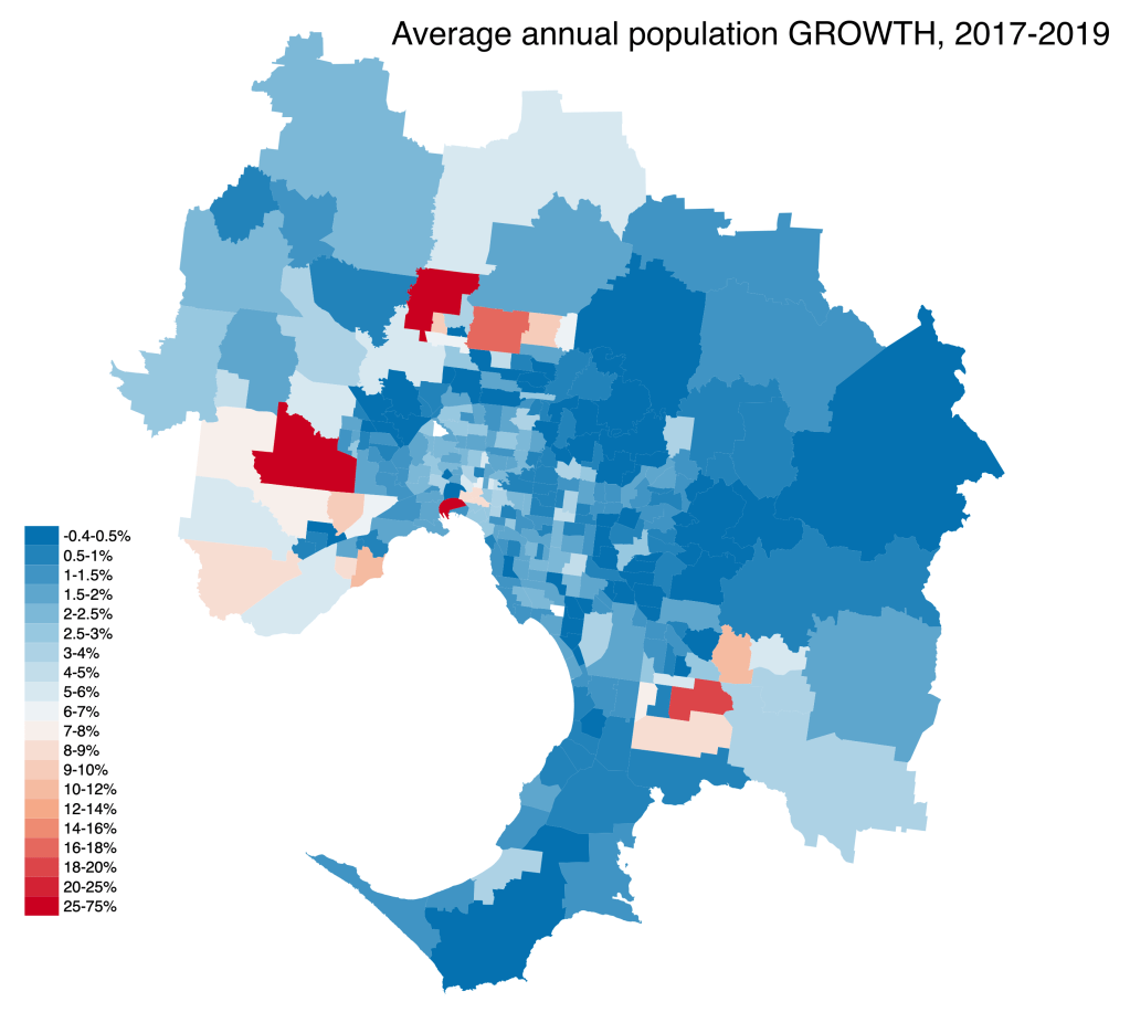
The first map shows a lot of blue, reflecting that net growth is quite slow in many areas of Melbourne which are already well-established. The urban fringe growth areas to the south-east, north and west are the only red areas. There’s also a ring of middle-level growth (around 5% pa) in inner suburbs around and north of the CBD.
The second map is almost entirely red. In most areas, change is 2-3 times higher than growth. There’s a large population ‘churn’ in inner suburbs around the CBD (probably reflecting larger numbers of rental apartments, and students), and a few distinct pockets in the eastern suburbs (at activity centres), as well as the urban fringe growth areas.
It would be nice to be able to do similar maps for employment and education (the destination areas for many journeys, especially in peak hours), but that data isn’t available to this level of detail. I’m sure it would illustrate similar, high degrees of change.
Evidently, people are frequently moving home. In this process, many are also likely to change where they work, school and shop. In 3 to 4 years, many areas could see more than half their populations change. This is more than enough to keep travel choices changing regularly and reduce widespread, entrenched habits.
If one adds to this the effects of increasing use of GPS-aided travel (with congestion-aware apps) and autonomy of vehicles, it’s likely that travellers will become more and more responsive to changes in transport supply.
The idea that travel behaviour changes (changes to origin, destination, mode and route) take anything more than 1-2 years to materialise after a new project opens seems very unlikely. Land use changes will take longer, and should always be assessed separately, unless you’re using a LUTI model.
COVID effects
All this analysis uses pre-COVID data. It’ll be very interesting to see what happens to the pace of population change, as well as growth, in the wake of the pandemic.
The real estate market has slowed, but not stopped; many have been buying properties sight-unseen, or with online walkthroughs. Also, it looks as though quite a few people are moving out of Melbourne altogether, to move into regional areas or interstate.
As well as a slowdown in population growth and a change in internal relocation patterns, the pandemic has also temporarily halted a lot of travel. As people return to a new ‘COVID-normal’, some shifts in habit will undoubtedly occur. There are doubts that public transport will return to pre-COVID crowding levels (at least, not before a vaccine is available). Some authorities are taking the initiative to encourage more sustainable transport modes and travel choices. Predictions suggest that working from home will become much more widespread.
All of these factors will change previously established relationships between demographics and travel. We’ll need to re-base our transport models to account for this.
The ABS population change data will be very interesting over the next couple of years; I’ll continue to monitor it.


Leave a comment